PRODUCT DESIGN
2 min read
Invisible Design: When the least is the most

What is Invisible Design?
If using for the first time or rarely interacting with the product, the users will begin to learn how to use and the mechanism of the product. If the product design is not optimal, users easily fall into a sense of confusion, having to do “trials and errors” many times to discover how to use the product. However, that experience is not always pleasant, so users can easily get frustrated and leave after getting used to the product.
Therefore, the role of an optimal UX/UI design is extremely important, making each of these initial interactions more natural, closer to the user, skillfully guiding them with visual instructions through the user interface and also through design techniques drawn from psychological studies, natural human behavior as well as common prejudices that UX/UI people need to know.
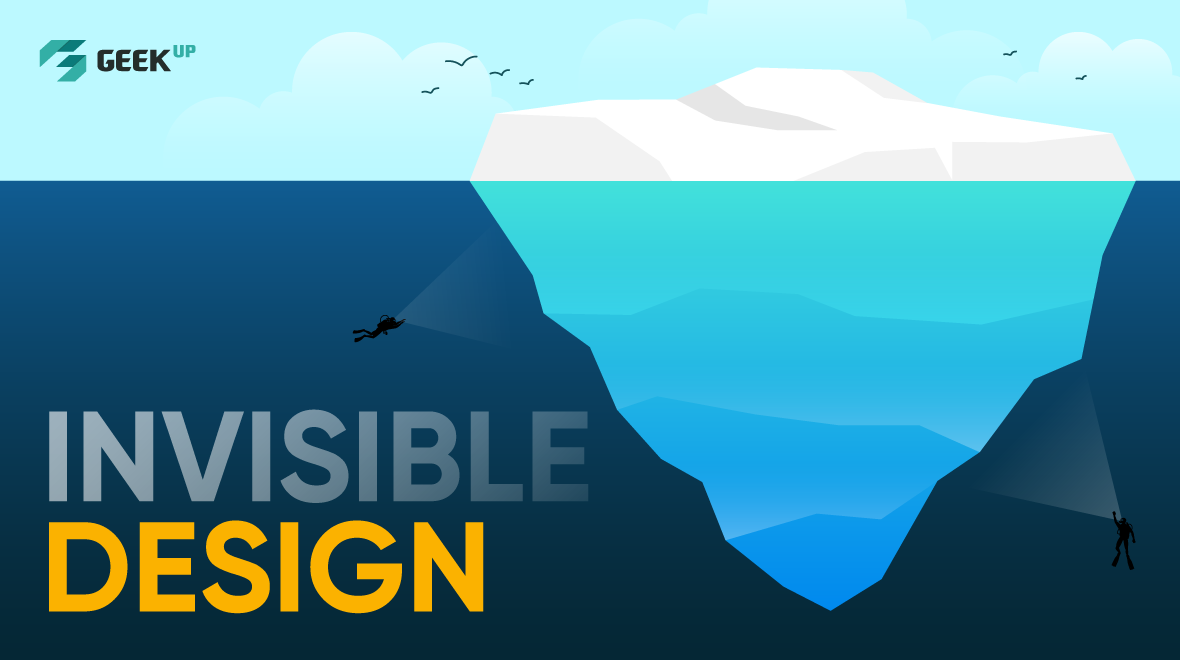
Invisible Design aims at optimal designs, "hiding" details that can bring a feeling of restraint and unnaturalness to users when performing a series of necessary interactions to use the product effectively with minimal and intuitive experience design efforts.
The levels of Invisible Design
Aesthetic invisibility
This Invisible Design level focuses on minimizing cumbersome details with no specific function in product UI as well as graphic designs, only retaining the balanced design, scientific structure, intuitive and easy to use for users.
Interactive invisibility
Many softwares released a century ago had "cramming" menus, advertising tabs as well as trying to immediately introduce a series of features for users from the very first use. Meanwhile, many applications today are geared towards the journey of leading users through simple and natural "swipe left and right" gestures "as natural as breathing". Features are set back and appear only when in need as a silent but helpful supporter.
These invisible but very useful interactions can be seen in map applications when actively displaying suggestions to adjust the route if the user runs into the wrong direction, or the red-underline spell check feature gently reminds the writer when there are word errors. Behind those natural interactions is the relentless effort of product designers who want to eliminate cumbersome details and make every interaction intuitive, friendly and increasingly "invisible".
Product invisibility
At the product level, design is no longer just about interaction, but also about fully automated product operation. The product team uses the power of technology to automatically optimize the experience, making it more convenient for users to save the steps that need to be taken to interact and use the product effectively.
Visible Elements (UI) for Invisible Design
Back to the Aesthetic Invisibility level, elements the design team can immediately work on to improve for more intuitive “invisible” visual experiences for users as mentioned below:
- Content and language: Words can show the tone of voice and significantly affect the emotional feedback from users. Use language in the way the product team wants users to feel when interacting with the designs. Adjust the tone of words and letters as naturally as possible when trying to read them out loud.
- Coloring: Colors in particular and color combinations in general can evoke certain emotions in each person. Choose your color palette carefully and place colors in the right places, helping users perform specific actions as desired, as well as creating a feeling of comfort, ease and harmony between elements. Some products will require the designer to consider cultural as well as emotional factors when using color.
- Typography: Each set of fonts (typefaces) has its own meaning, conveying its own nuances, be it simple or formal. Therefore, the designer also needs to pay special attention to conveying "invisible" emotions through the design of the letters.
- Images: the details in images, animations or videos of a product can have a strong impact on "invisible" emotions in users. Factors such as video speed, hot/cold tones or considering the appearance of people in a frame, .. all need to be carefully considered to ensure users do not get lost, but focus on exactly the message the team wants to convey.
- Icons and UI elements: The synchronization of icons and UI elements is also very important for an invisible design when helping users understand how the product works and how to interact with the product through every touchpoint without thinking too much. The design effects also ensure to convey the right mood and personality of the product, meeting the product's goals while keeping the most natural and intuitive user experience.
UX Tips to apply Invisible Design for a digital product
Along with tangible factors, intangible improvements also contribute to optimizing the user experience. Here are a few suggestions the product team might consider:
- Simplifying user experience flow: A minimalist user experience flow not only showcases the talent of the designer, but above all, helps users achieve their goals more quickly and easily. Techniques include sketching out the user experience flow in advance, eliminating cumbersome steps, designing a more minimalistic step-by-step, and don't forget to experiment to test assumptions and improve the product.
- Communicating Clearly: Every time users interact with the product and feel confused, they are clearly having a bad experience. Clear communication is the ultimate goal of Invisible Design, reflected in the contents that convey accurately, especially UX Writing for Digital Banking.
- Providing an undo option for users: Let users correct their mistakes by themselves with options like an “Undo” button, or allow them to freely input data on their own while the team uses “underground” auto-tuning command lines to standardize formatting. The team should consider the feature of automatically saving users’ progress, or accompany the feedback in case users encounter errors with guidance for the next action.
References: fadeyev.net, intercom.com, designmodo.com
5 likes
Get latest updates from GEEK Up
Our email packed with digital product insights, trends and case studies.


